
If I were to sum up my thoughts on this whole choosing-paint-colors-for-the-new-house process, it would sound something similar to:
AaurrgggHhhhhh!

After months of agonizing over paint chips and surfing Pinterest for inspiration, I selected my favorites and bought a ridiculous number of paint samples from the local Sherwin Williams Store.
I rushed to the house and enthusiastically slapped colors all over the walls in shadow, direct sunlight, and every other lighting scenario in between. When I stepped back to admire my carefully selected colors...I was thoroughly discouraged.
The grays were suddenly blue, everything was waaay darker than I expected, and we ruled out 90% of our choices on the spot. What a relief I learned this early with paint samples, rather than later with expensive walls I hated...but...it was now back to the drawing board.
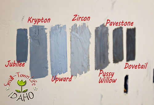
Between the camera and different computer monitors, this picture does not accurately represent what we were looking at, but you get the general idea.
After further deliberation, research, and paint sample splashed walls, I think the final decisions have been made. Emphasis on think.

Sherwin Williams -- North Star
I really wanted a pale blue-gray for the kitchen and/or bathrooms that didn't look like a baby boy's bedroom. Eventually, I found that any color appearing remotely blue on the chip--or even in the can--was way too blue on the wall.
When I bought a sample of North Star, I actually questioned the attendant, because it looked sooo gray. (Do you see any blue in there at all?) But once on the wall, it was perfect. Just the right amount of blue to be pretty...without being juvenile.

This on-line example might help you visualize it.

SW -- Pussy Willow
This color will probably go in the bedrooms.The new trend for wall colors seems to be leaning toward grays rather than beige. I think gray is a lovely neutral.

{source}

SW -- Dovetail

Pussy willow example
SW -- Dovetail
This dark gray-brown will go in the entry way accompanied by a white wainscoting, four feet high.

Dovetail example #1
{source}
Dovetail example #2. This picture makes it look slightly lighter than the samples looked on my walls. But I like this cute room.

SW -- Repose Gray
A light gray was the hardest color to pin down. Why did my choices always look bluish? After extensive research, I found this helpful explanation...
Basically, grays have three undertones: blue, green, and purple. It is often hard to identify the undertone without first comparing it to other gray samples. Once on the wall, gray paint with blue or purple undertones, suddenly look blue or purply, rather than gray. If you want it to really look gray, you have to find one with a slight green undertone.
So that's what I did. And I loved it as soon as my paint brush touched the wall.

Anyway. There you have it. If you don't like these colors...do me a favor and don't tell me. I am so sick of rehashing the same colors over and over...and I need my brain to move on to the next big decision:
tile and counter tops.
14 comments:
Those are the EXACT colors of our house right now! I went through the same agonizing pain a year ago when I couldn't decide on the "right" color for our home. The "grey" colors that I brought home looked "blue" too!!!! Seriously, it was ridiculous! But I LOVE the colors we have now, and I KNOW you'll love your finished product! Good luck with the rest of the planning!!!!
Love it :)
When all is said and done I think it will look beautiful...I love gray and yellow together...I know you are not doing the yellow, but I remember a house I used to drive by growing up and it was gray and yellow...and I always said that someday I would have a little house that looked just like that...hasn't happened yet...but, who knows...maybe someday!
I love those colors! Grays are awesome.
I know I just stumbled upon your blog but I intend to check out every post about house building since we are starting to build ours in about 6 weeks. And these paints colors - gorgeous! I knew I wanted to go with gray tones but I think now I can just copy you! :) Beautiful house so far and I look forward to all the other posts I have yet to read.
Whats the name of the gray paint with the "green" undertone in the last photo? it's beautiful!
SW Repose Gray
Your work is beautiful. I especially like the sw repose grey. But one question, what preps did you use under that? I.e. white emulsion, grey undercoat etc? It would be helpful if you could provide the brand and product code please. Thanks.
We had the same issue with the blue tinted grays! We also have settled on repose gray, but now are choosing trim color? What color is your trim? Thanks for sharing pics!
The trim color is Sherwin William's base color. There is no color added...it's just a base white.
I came to see your wall colors but all the pics have a red x and I can't view them.
I just wanted to let you know that I linked to your blog today as I blogged about the fact that I want to go from beige to gray. I love all of the shades of gray that you used in your beautiful home.
http://armchairdecoratorblog.com/2015/03/23/dreams-of-white-and-gray/
Thanks for the inspiration!
Oh my gosh, you might have just saved me from pulling out my hair. I have 5 different shades painted on four different walls of my house and I am currently standing at the paint counter in Lowe's waiting for my quart sample of Repose which I ordered immediately after finding your blog post. Fingers crossed, you might have saved me a ton of time.
Wow! I too bought a ridiculous amount of paint samples but it paid off. I found a couple beautiful greys. I highly suggest paint samples to check those unwanted undertones. I choose SW Repose & Colonade as a couple of my choices. I love them!
Christina
Post a Comment